How to use Gephi for Data Analysis
Gephi is a visualization and exploration software for graphs and networks. Like Photoshop but for graph data, the user interacts with the representation, manipulate the structures, shapes and colors to reveal hidden patterns. This tutorial will provide you an overview of Gephi.
Installation
Gephi is open-source, free to download and runs on Windows, Mac OS X and Linux. For installation, you can visit Gephi.
Data Processing
Two kinds of data files:
-
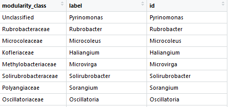
“Nodes” list: Contains the identifiers of each nodes, their label and their id.
-
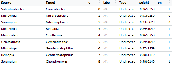
“Edges” list: The first two columns are the node ID and the other column is the correlation coefficient.
Importing Data into Gephi
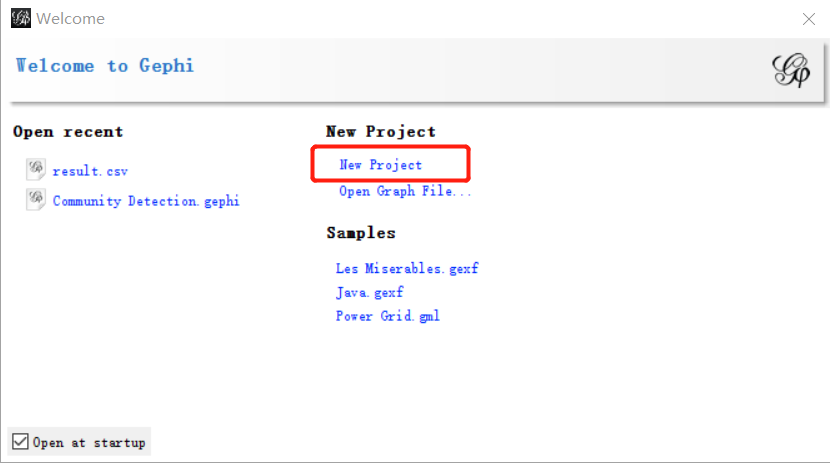
Run the application on your computer, click “New Project” to create a new Gephi project in the start menu.
Click “File” -> “Import spreadsheet” -> Choose your data file and click “Open” to import your data files.
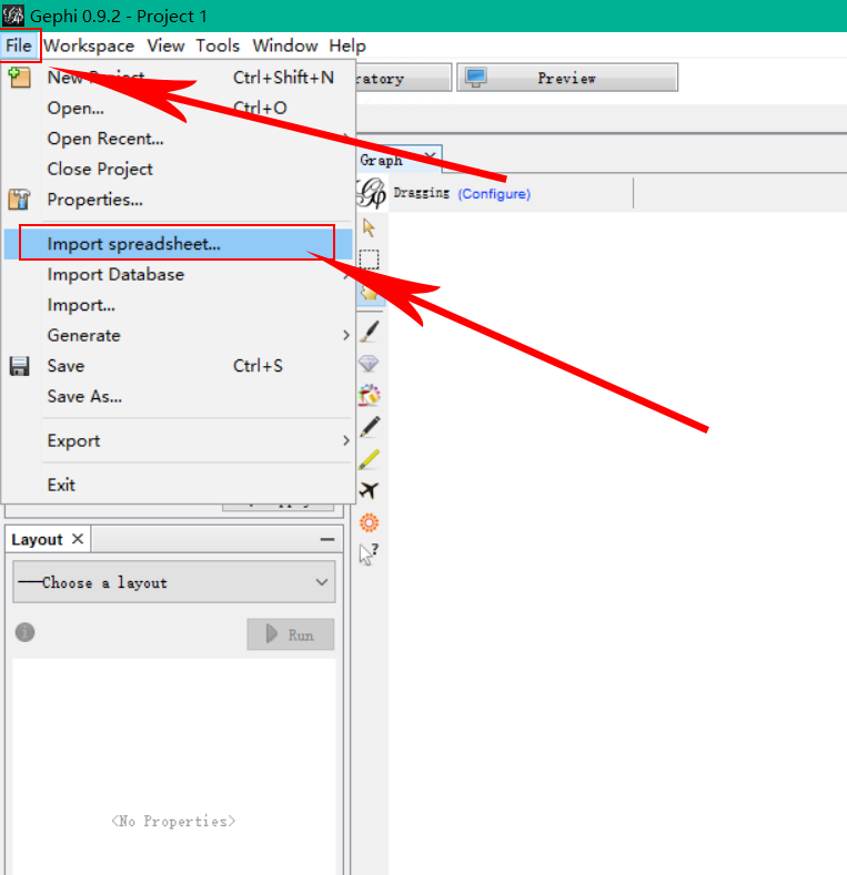
Specify all information that is required:
- Separator: Specify the separation (comma, semicolon, tab or space) between your data.
- Import as: Choose the kind of data file you are importing (Nodes table, Edges table, adjacency list or matrix)
- Charset: Select the encoding of your data.
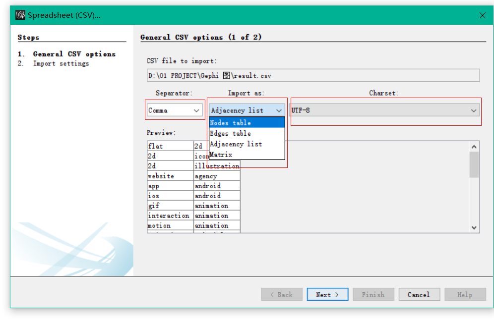
Click “Next” and “Finish”. You should now see a graph.
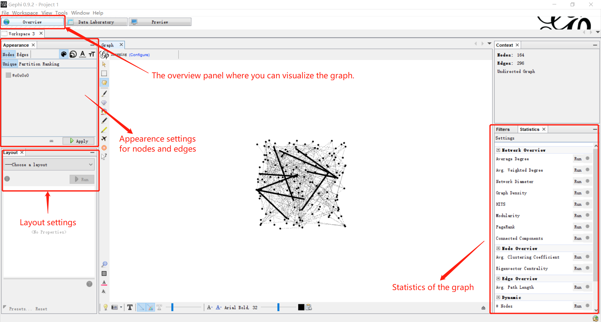
Visualization
The action now takes place on the overview panel. The software produces an overview of the graph, spatialized randomly (and completely unreadable). We need to set some layout styles to make it readable.
Run a layout
Layout algorithms set the graph shape, it is the most essential operation. Gephi offers a variety of layout algorithms including ForceAtlas, OpenOrd, Circular Layout and etc. After choosing a layout, there are multiple properties you can change to control the algorithm in order to make a readable representation.
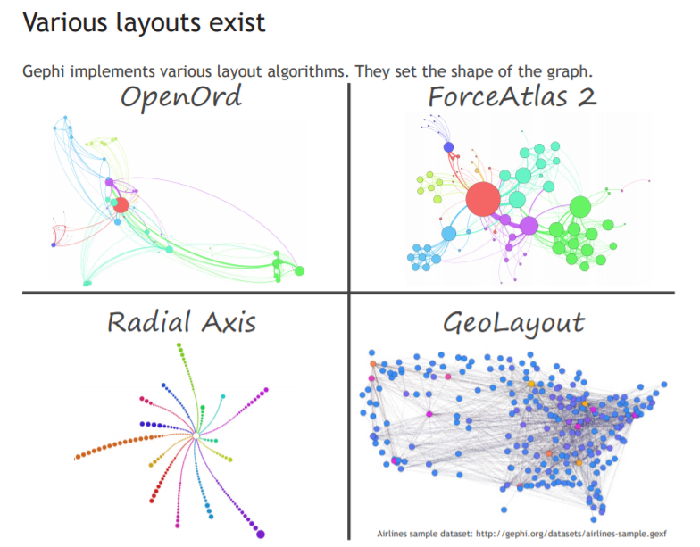
You should select one layout algorithm according to the feature of the topology you want to highlight. Gephi provides a detailed Tutorial Layouts which explains all kinds of layout algorithms and how to control them.
Here I will take the ForceAtlas as an example:
- Locate the Layout module on the left panel.
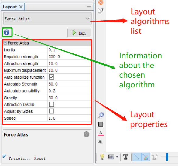
- Choose “Force Atlas”. And you can see the layout properties below.
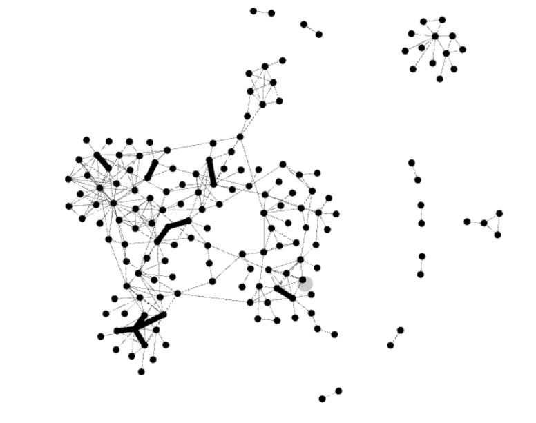
- Click “Run” to launch the algorithm. You can see now the positions of nodes changeing in real time. Let tha algorithm run until the graph is stablilized.
- Click “Stop” to stop the algorithm. You should now see a graph with the layout applied. Use the little blue magnifying glass (bottom left of the graph panel) to re-center the zoom.
- Then you can run “Noverlap” and “Expansion” algorithms to prevent nodes overlapping.
Set Appearance
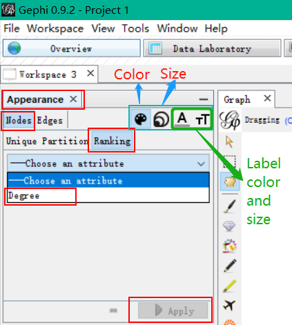
Next we can change the size, color of the nodes and edges to make the graph more readable.
- Locate the Appearance module on the left panel.
- Click “Nodes” -> “Ranking” -> “Choose an attribute” -> “Degree”
- Then you can choose a color that you like.
- Click “Apply”.
- Do the same with Edges.
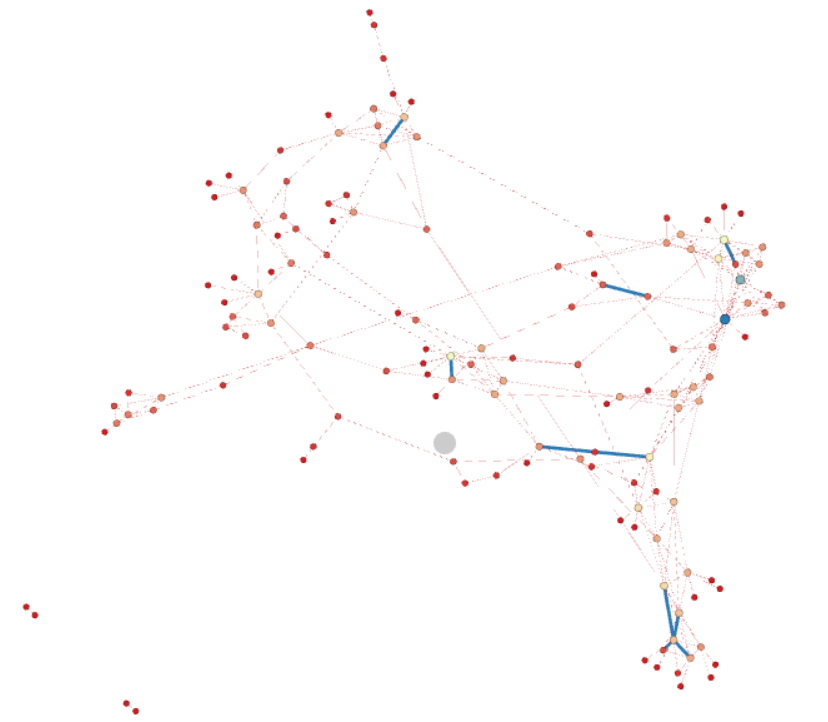
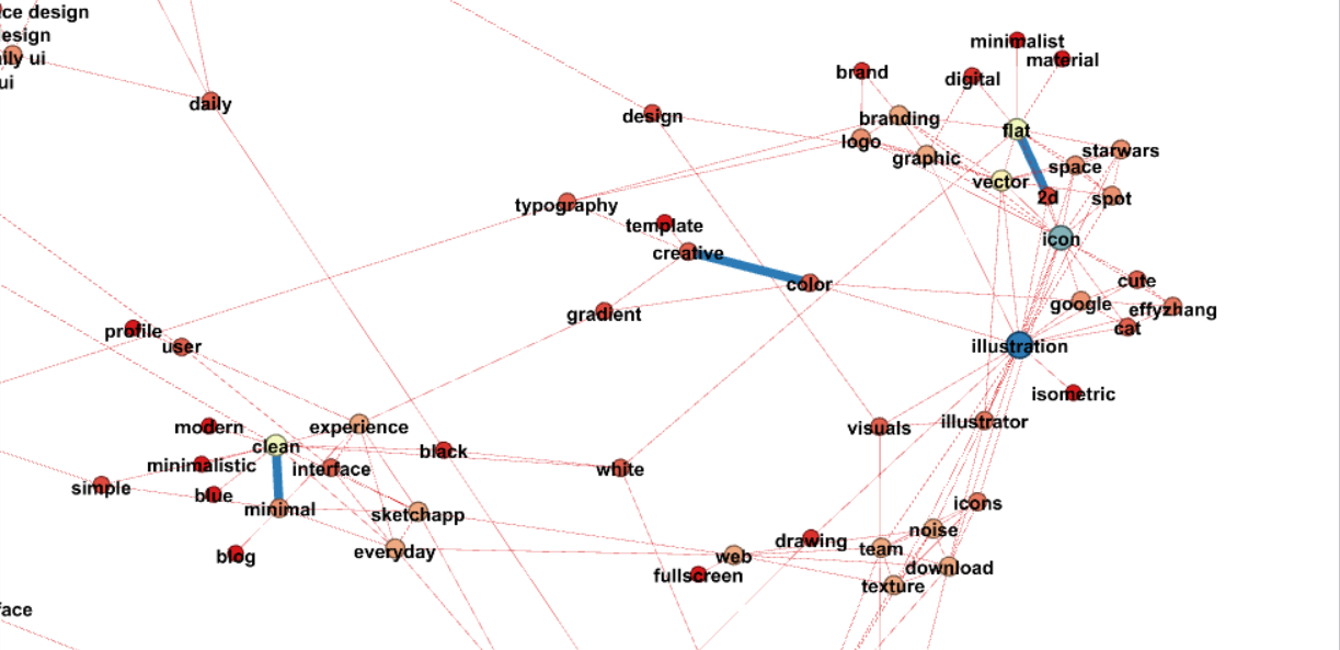
Now you can see a colorful Force Atlas graph.
Set Labels
There is a tiny black arror at the right bottom of the graph display. Click that arrow and you can find the Label panel. Then click the black “T” to add labels.

You can set different font styles, colors and sizes. You can also choose to add labels to the nodes, edges or both. If wanted, you can also click on the “Configure” link to set the data you want to get displayed.
Preview and Export
Before export graphs, you can go to the Preview panel and check the final details. You can change properties on the left Preview Settings panel. Changing settings in this menu is reversible, and do not affect the structure of the graph. The graph may take a few seconds to update after each change (click on Refresh to apply the changes). If your preview window still doesn’t work, try the following instructions: Go to main menu, Windows and then click preview. Also click Preview setting. Now press refresh on preview setting tab, you will find the preview.
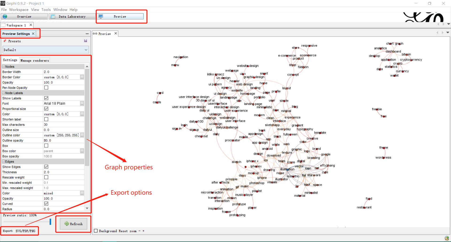
At the bottom of this preview column, you find an export link. Note that exporting in .png produces figure with a poor resolution. You may want to output for .svg or .pdf, which have the advantage of being modifiable by your own image/drawing software.
Community Detection
The visualization only is not enough for data analysis as it often needs other mathematical means to provide the researcher with a satisfactory result. The Statistics menu on the right provides more options: degree measures, density, path length, modularity and etc…
In this tutorial, I will show you how to generate a community detection graph.
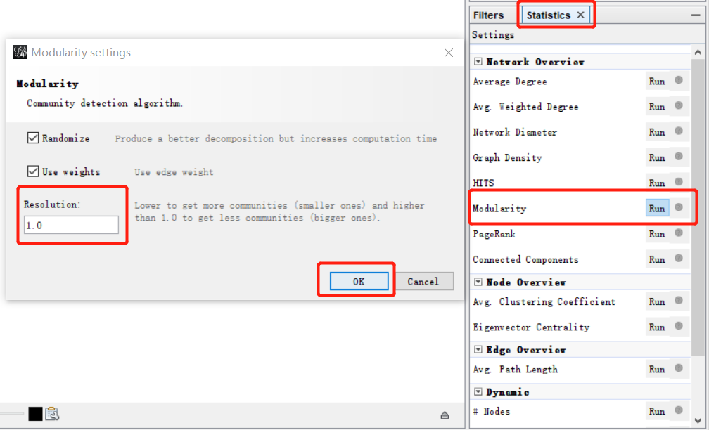
- Locate the Statistic panel on the right of the Overview page.
- Find “Modularity” and click “Run”
- Set Resolution value (default 1.0). Lower to get more communities and higher than 1.0 to get less communities.
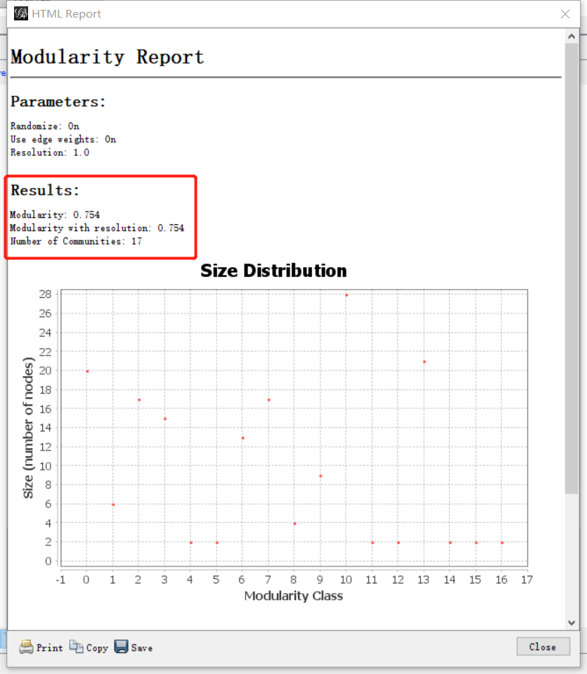
- Click OK to view the modularity report. You can see the number of communities on the report.
The next step takes place in the Partition menu situated in the left column of the Overview page. Select “Nodes”, “Partition” and “Modularity Class” (rolling menu). You will be then able to modify the colors attributed to the detected communities by clicking on them.
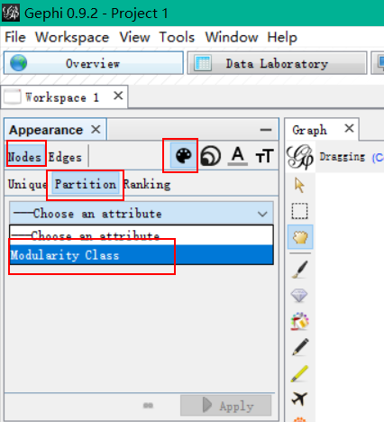
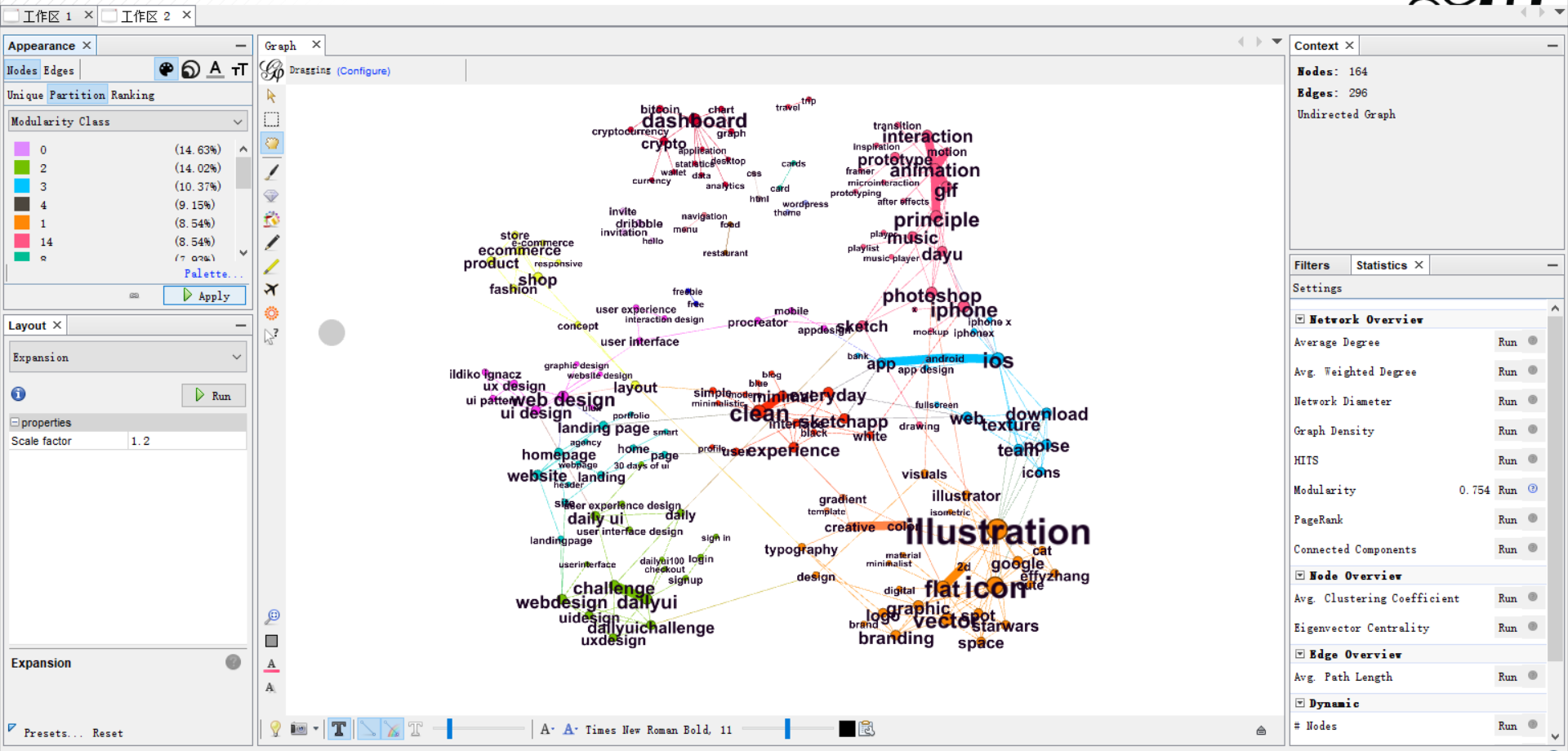
Once you have set up a color for each community, click “Apply” and you can see the community detection graph.
Conclusion
I hope this tutorial can help you start with Gephi. Gephi also provides various tutorials which you can refer to. There are also plenty of wonderful video tutorials on Youtube. I list one here if you are interested.
